IBM SPSS Statistics
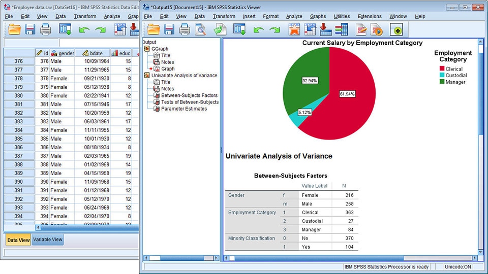
I’d like to say that this is by far the most complex project I have ever worked on. The first version of SPSS was released in 1968 and it used punch cards as an input. For half a century, this application was growing and it became a powerful tool for statisticians with more than 100 different procedures, tests and, analyses. Some parts of the application give users complete freedom in what they can do and it makes this project unique in terms of problems that we had to solve as a design team. Currently, it is one of the most widely used statistical applications in the world.
- Role: UX Engineer
- Team: 10+ designers and 30+ engineers
- Duration: 3 years (2017 - 2019)
- Download the new SPSS Statistics UI on the IBM Marketplace
Mission: Redesign IBM SPSS Statistics
Transformation
First of all our team was conducting research, we wanted to know what people think about the current SPSS version. We learned that less experienced users often were intimidated by the complexity of the software. Therefore, we focused on simplifying basic workflows and providing beginners with an easy onboarding to statistics and the application. Let's go through some of the changes that we introduced recently.
1. Navigation
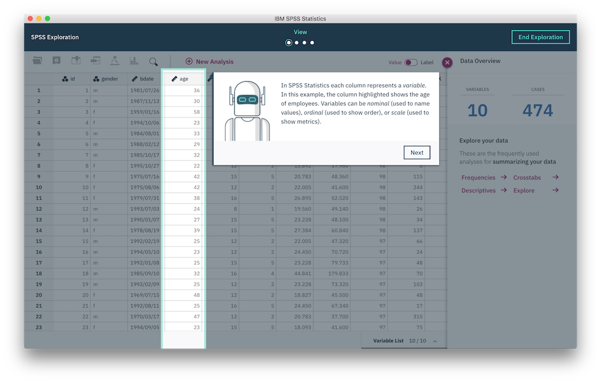
We learned that a big amount of modal windows actually leads to high cognitive load. To solve this problem we minimized the amount of modal windows and used different UX patterns to make sure that users do not get lost in the application. Here is a short animation that illustrates our solution.
2. Onboarding
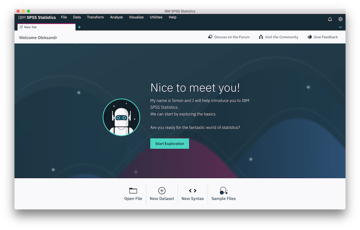
One of the first discoveries we made was that first-time users needed to spend a considerable amount of time reading documentation and textbooks and viewing tutorials before getting started due to lack of familiarity with the domain and product environment. We determined the product needed an immersive getting started experience that would provide an easy-to-digest user flow and make intensive study or training unnecessary.
We have created an onboarding experience that introduces SPSS and basic statistics to our new users. Learning by doing is the best way to explore a new application and we use this principle in the onboarding process.
3. Iterative Workflow
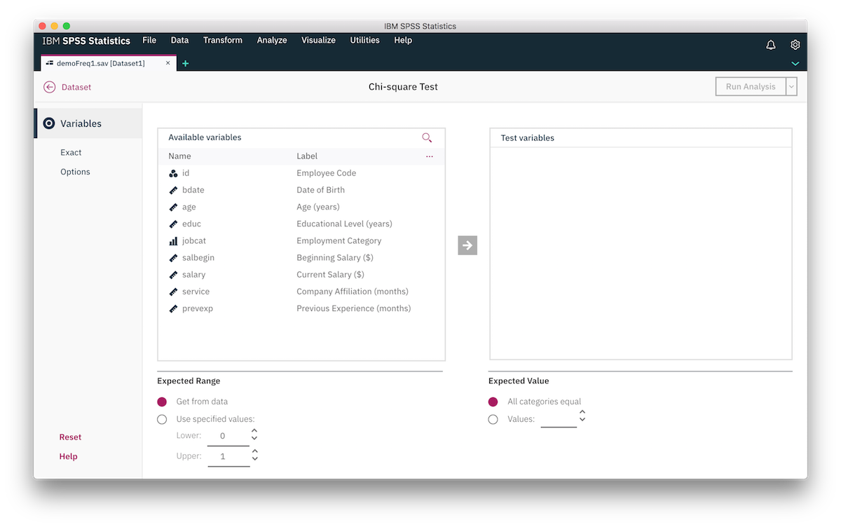
We talked to experienced users as well, and for them, it's important to keep focus and do productive work. We introduced an iterative workflow that allows users to make changes to the final results and, if necessary, re-run an analysis on a new dataset.
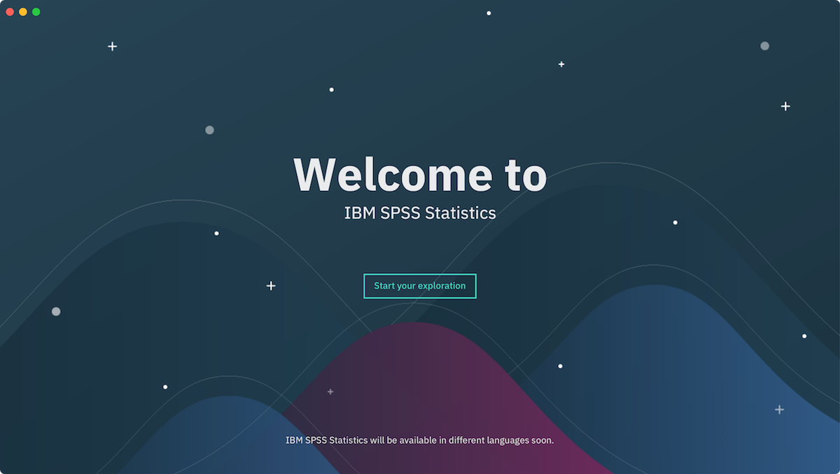
4. Small details
We worked not only on big stories and flows but we tried to add small touches in all parts of the application. One of the examples is the very first interaction of a new user with the application in which SPSS welcomes the user in different languages.
We redesigned a lot of aspects of IBM SPSS Statistics that I didn't cover here. Our ultimate goal is to invent a better way for people to interact with statistical software.
My Role
As a UX Engineer, I use my software engineering and design skills to works on product design. I’m a technical voice in our design team and I help other designers to better understand the constraints that we have in the software. At the same time, I work closely with the development team to contribute and learn more about our codebase and the application itself.
Process
Design teams at IBM consist of User Researchers, UX Designers, Visual Designers, and UX Engineers. As a member of a design team, I work on UX concepts and prototypes. I am involved in all steps of the design process and partly in the engineering process. Here are the main steps of the design and development process.
- Research
- UX/Interaction design
- Prototyping
- User tests
- Visual design
- Engineering
- Review
The process is not linear and at any point of time, we go back to rework something. I'd like to cover a few steps of the process where I'm involved the most.
UX/Interaction design
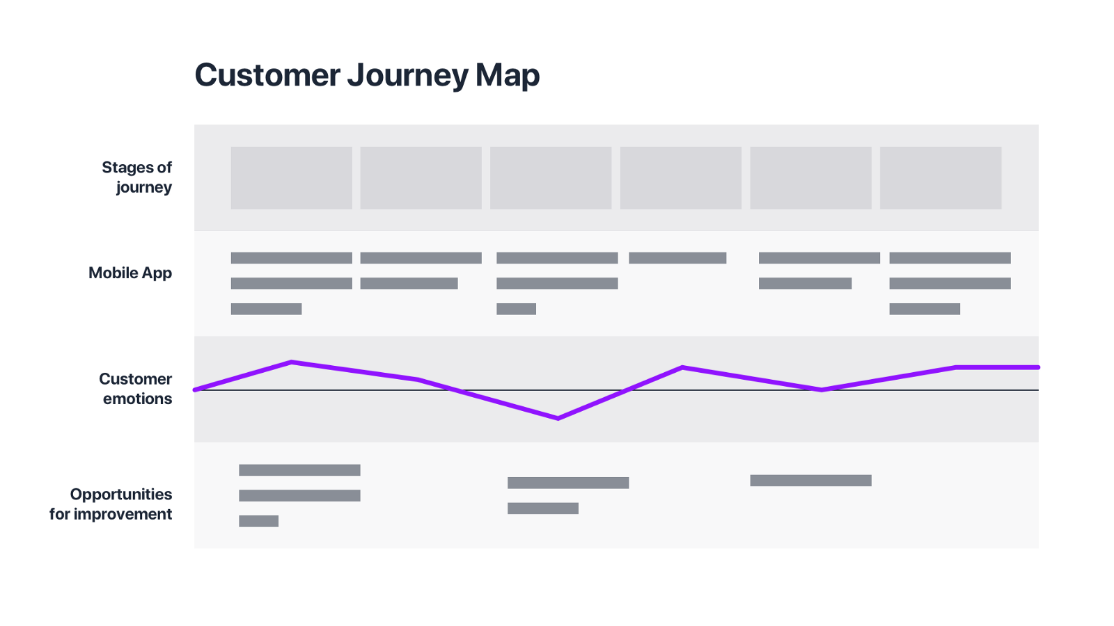
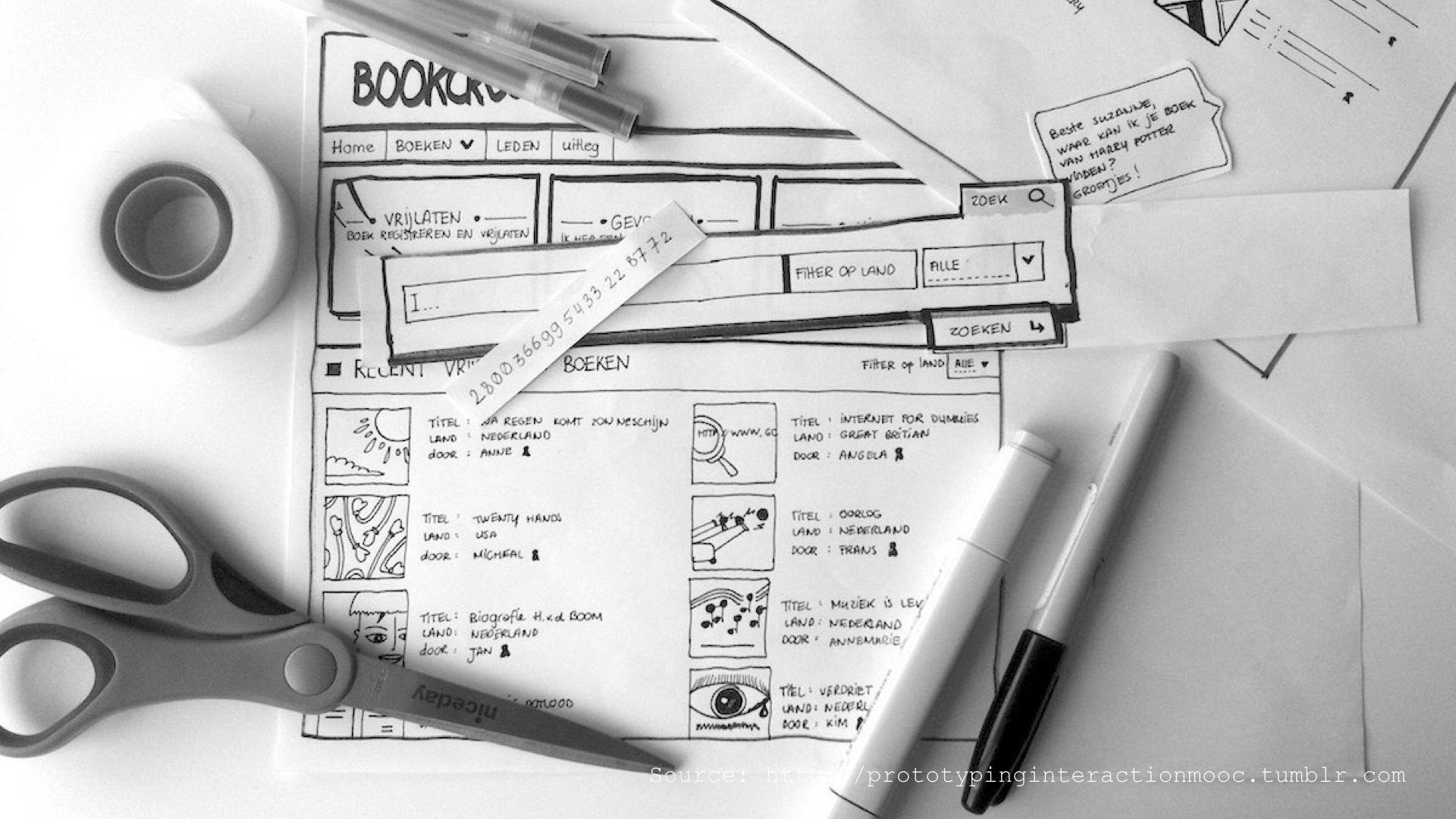
Based on research outcomes our team defines a couple of hills (statements, big goals). Usually, we divide our team to smaller squads and we work on different hills in parallel. First of all, we build a user journey map based on research artifacts. Our goal is to understand pain points and make sure that we keep existing positive user experiences. We work on big ideas and define to-be scenarios. That’s the time where we use paper prototypes and storytelling to communicate our ideas and concepts to the users to select the best ideas. While we are building UX concepts we take time to make a few playbacks to align with the engineering team and check the feasibility of our ideas.
Prototyping
The to-be scenarios are mostly focused on user emotions and do not cover user interfaces that much. This is why the next step for us is to bring the stories back to the screen and we use prototyping for this. Together with UX designers, I work on medium-fidelity prototypes and after a few iterations, we get together with other team members to show our work. The review sessions are essential for our team. People work on different topics but it’s crucial to share what we do. It helps us to align, get other opinions, but most importantly, be consistent in the UX patterns that we use across the application. After the review session, we decide what exactly we want to test with the sponsor users and I create a few interactive prototypes using HTML and JavaScript. This is the time for UX Engineers to shine. I build prototypes based on a user test scenario. In our team, we use pair programming technique to work on interactions and animations. It’s not classic pair programming because the second person is a UX designer so the conversation is mostly around motion design.
User tests
The next step is user testing where we show our work. Depending on the scenario we use qualitative or quantitative user tests. I really like to participate as an observer and watch how our users interact with prototypes. Each time I understand a bit better how the users think and I see many opportunities and ways to improve the application even more. Most of the time after the user tests we go back to UX concepts or just tweak already created prototypes and then we test everything again. After a couple of iterations, we can move forward to the visual design.
Engineering
As a UX Engineer, I contribute to the source code of the application. I support our engineering team and help with animations and interactions. I enjoy solving complex problems that all software engineers solve on a daily basis. Close collaboration with our engineering team is a great way to learn more about the application as well as the people who build it.
Review
The last step for the design team is the implementation review. We want to make sure that both UX and visual designs were implemented correctly. After a few reviews and additional user tests, we release an update.
Results
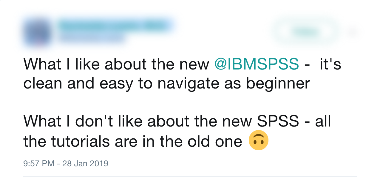
Here is a tweet that summarizes our work. We did improve the application, but we still have many opportunities to make SPSS Stats even better.
Our design team has been awarded the 2018 Red Dot: Communication Design Award in the Interface Design category and a couple of internal IBM awards.
If you scrolled till the end without reading then don't worry I've got a short video for you that summarizes everything that I wrote above.
Next poject: WhoCanFixMyCar.com →